Project Details
Brand Strengthening / Wordpress Development
Background
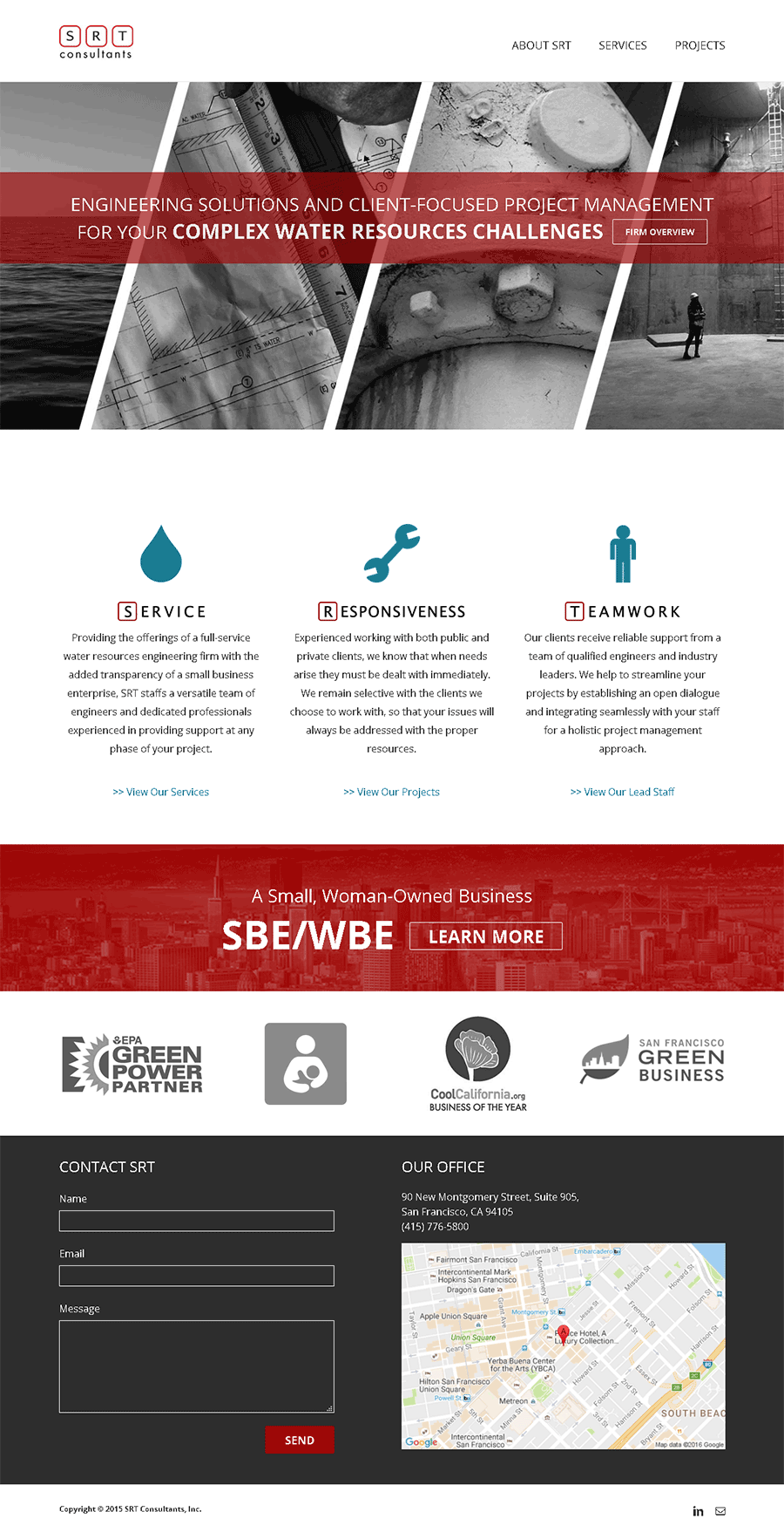
SRT approached us to help them design a website using present photo and copyright assets. We took those and refined them for digital display. We strengthened their online presence by tayloring colors, fonts, photos, and website interactions. Per client request, we developed the website off of the Wordpress platform for its ability to update content without any programming knowledge.
Experience Guide
Brand Colors
Our first goal was to strengthen their brands visual appeal. SRT's original brand color-scheme was red, blue and green. We decided to remove green and focus on two colors to represent the brand. We felt this would allow SRT to easily design strong brand-assets in the future. We went with a rich red as our primary color and a slightly muted blue as our contrasting accent color. These hues and tones were chosen for their strength and professional feel.
Typeface
A san-serif font was chosen for its modern yet corporate/professional feel. Titles, links and headers are capitalized to express SRT being an authority on water logistics.
Brand Development
We selected photos from SRT's asset library that were appropriate for each page. Black and white photos are overlayed with brand colors and bold type in the page headings to help develop brand recognition. The same design style is repeated in certain roll-over hyperlink interactions.
