Project Details
Design / Photography / Development
Background
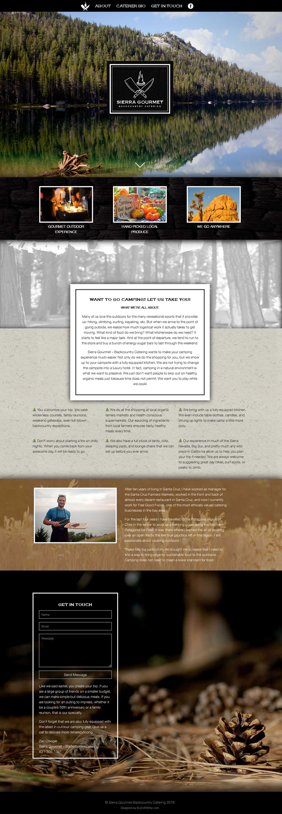
Sierra Gourmet is a catering company like no other. They will purchase the best produce and bring it to the wildest of locations to cook for you. They already had a logo and website, but both were outdated. The brand was suffering from an easily recognizable identity mark. What they were using as a logo was really a piece of art, too much going on to be immediently recognized and remembered. The look of their previous website lacked cohesion in design and contrast in its layout. Some photographs of California forests from our library were utilized on the website.
Experience Guide
Identity Design
The previous identity mark was more of an art piece than an easily recognized symbol. Though not usable as an identity mark itself, the elements in the design were wonderful. We extracted the simplest elements from the design that represented the tools need to cook in the outdoors, knives and fire. The knifes represent the act of cooking and the campfire represents the fuel to cook. The end result is simple, recognizable, and brand approriate. The symbol also was intentionally chosen for its ability to be enlarged or shrunken and still maintain brand recognition. For our wordmark, we choose a typeface that was classic, serif, and bold to represent Sierra Gourmet. We chose a san-serif font for the tagline "Backcountry Catering" that would contrast while still being just as bold as the serif heading "Sierra Gourmet".
Contrast & Feel
For the layout. we went heavy on photos and texture because we felt it was important to envoke the feeling of where Sierra Gourmet caters. We inlcuded some of our own photographs that felt approriate. Content for the one page website was seperated through the contrast of photos, colors, and texture.
